BCG Dataviz
Boston Consulting Group (BCG) is a pioneering global consulting firm with over 25,000 employees across 100 offices. Rare Volume created a data visualization system for BCG’s use across all print, video, and interactive media for the firm.
Client: BCG
From discovery to strategy to production, we led the design of a versatile data visualization system that enables an international collective of writers, editors, designers, and developers to create quality content consistently.


Within the system,three categories accommodate a wide range of data narratives, platforms, and marketing and communications objectives.
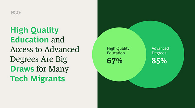
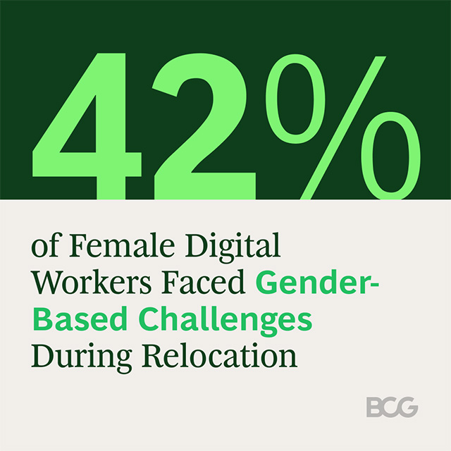
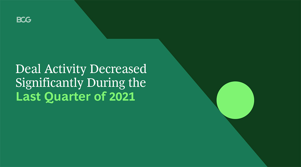
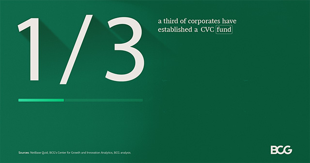
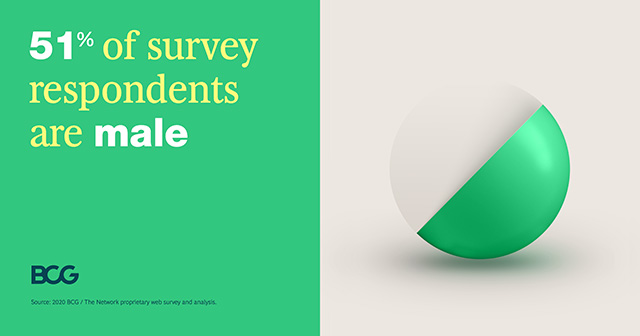
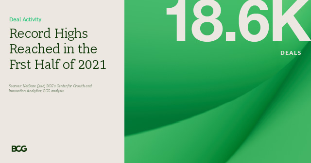
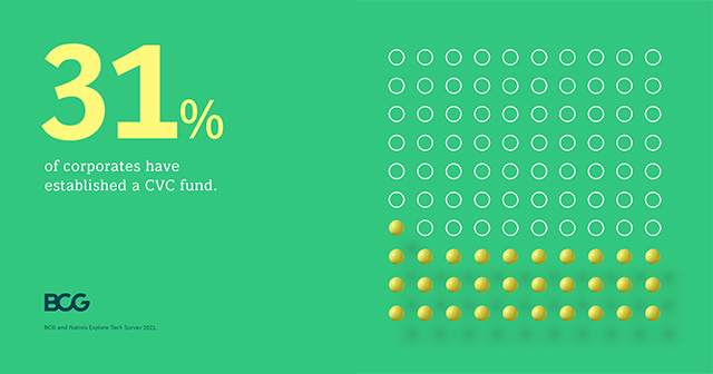
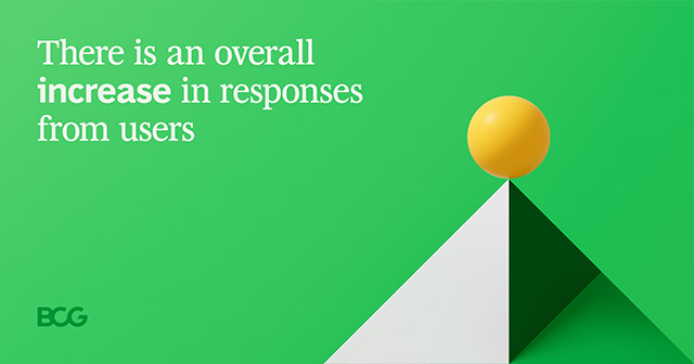
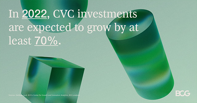
Category 1
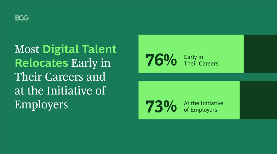
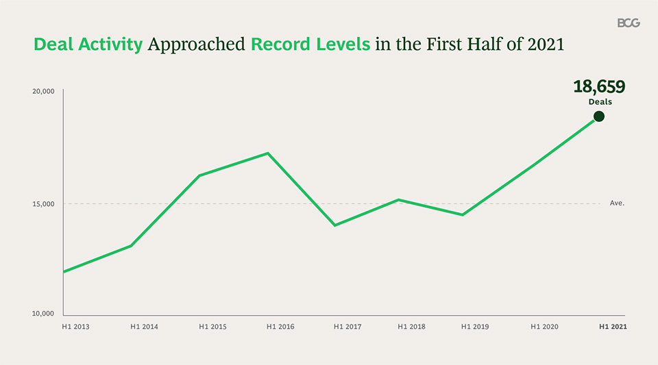
Data stories told through a single data point, visualized via text and representative graphics
Data Point:
1
Types of Visuals:
Increase, Decrease, Rebound, Percentage, Big number
Platforms:
BCG Social (LinkedIn, Instagram, Twitter)


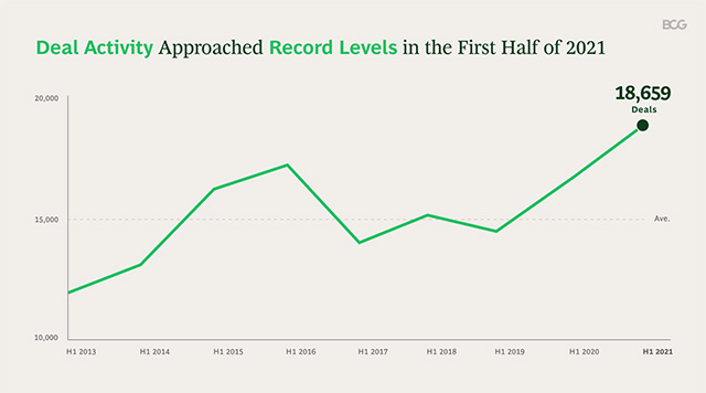
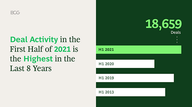
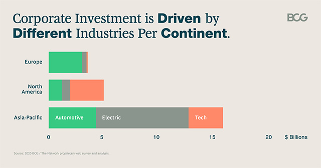
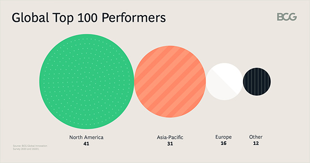
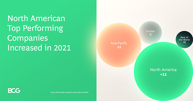
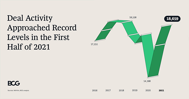
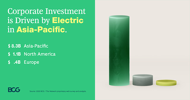
Category 2
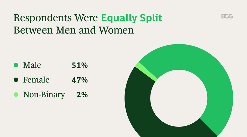
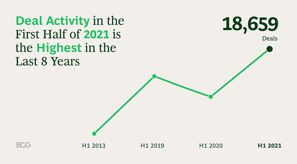
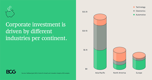
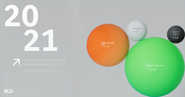
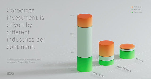
Exhibits with 2-4 data points. Best used to show comparison or change.
Data Points:
2-4
Types of Visuals:
Bar Chart, Stacked Bar Chart, Line Chart, Bubble Map, Donut, Pie
Platforms:
CG.com, BCG Social (LinkedIn, Instagram, Twitter

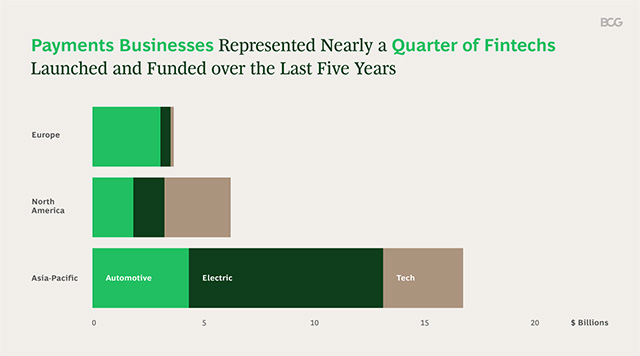
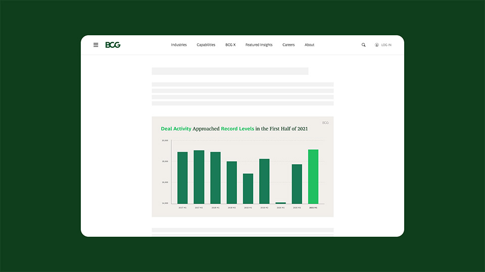
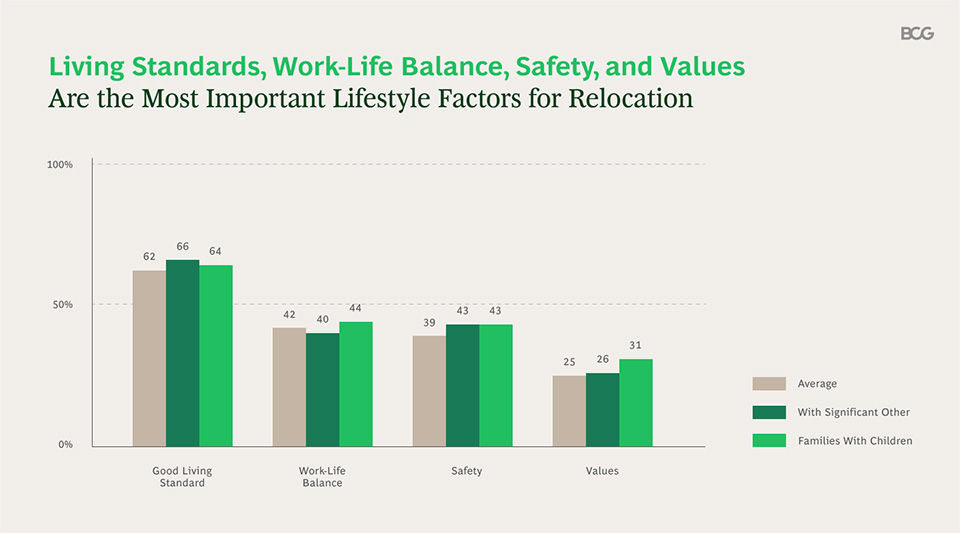
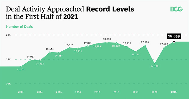
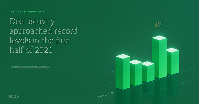
Category 3
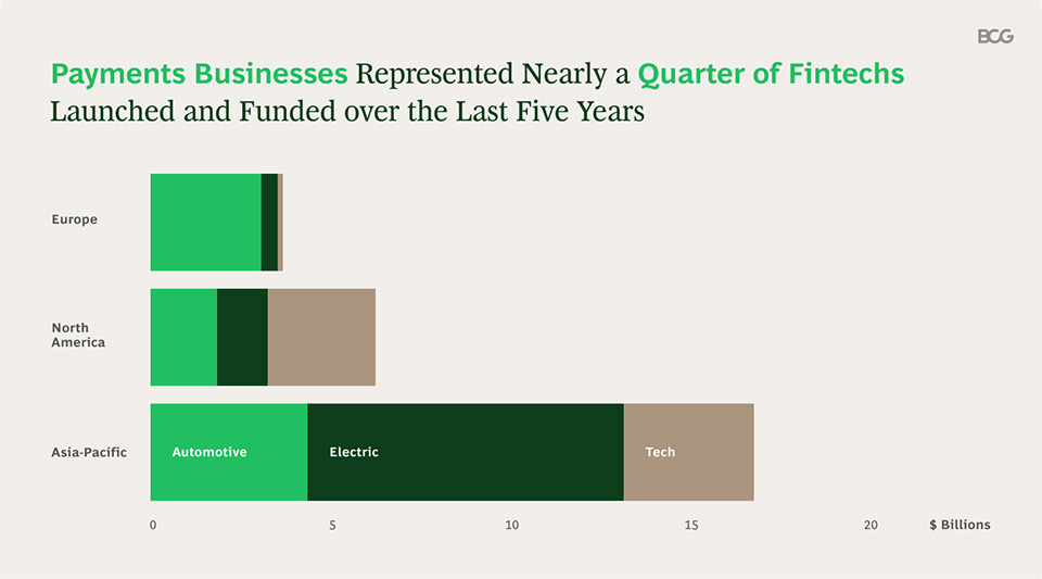
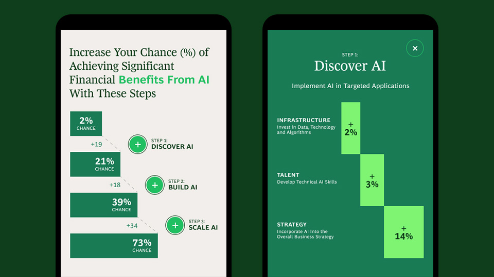
Data-rich visuals allow readers to contemplate a range of information that usually points to multiple insights and takeaways.
Data Points:
5-10
Types of Visuals:
Bar Chart, Stacked Bar Chart, Line Chart, Bubble Map, Area Chart, Stacked Area Chart, Scatter Plot, Treemap
Platform:
BCG.com
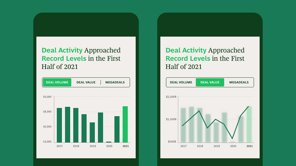
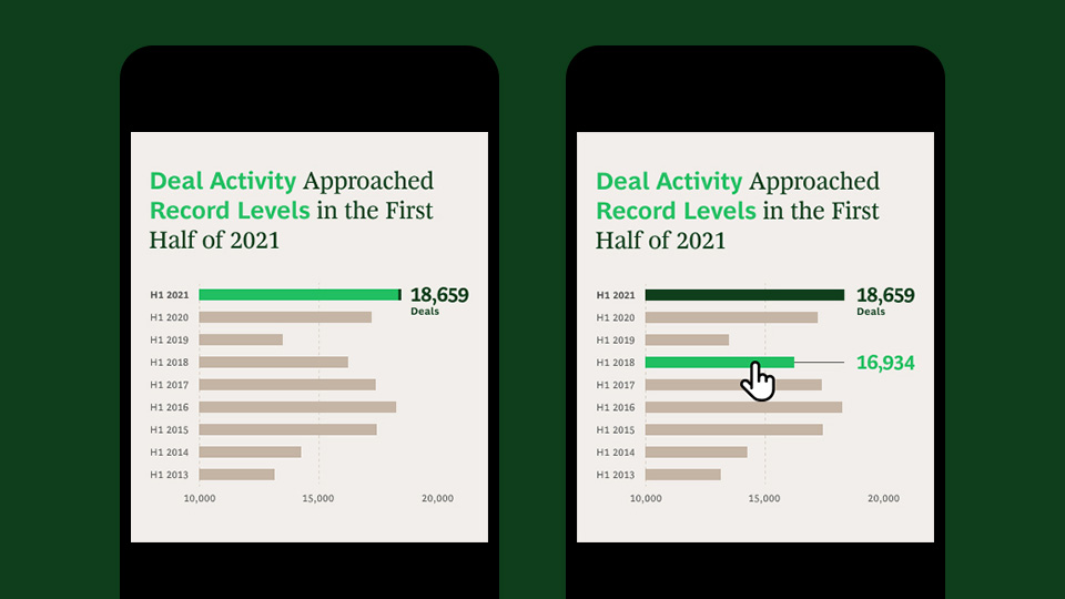
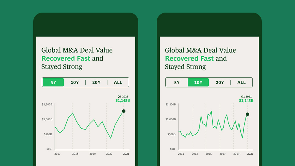
The system includes in-depth rules and best practices for revealing narratives through interactive design, i.e. hover, click, states, and more.
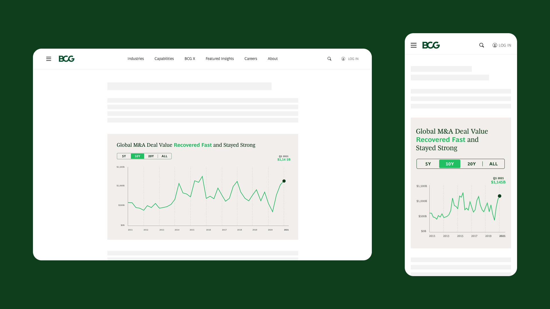
Interactive Overlay
Overlays provide context by presenting data sequentially and/or show related content for comparison.
Interactive Tooltip
Hover/scrub allow users to dig deeper into datapoints.
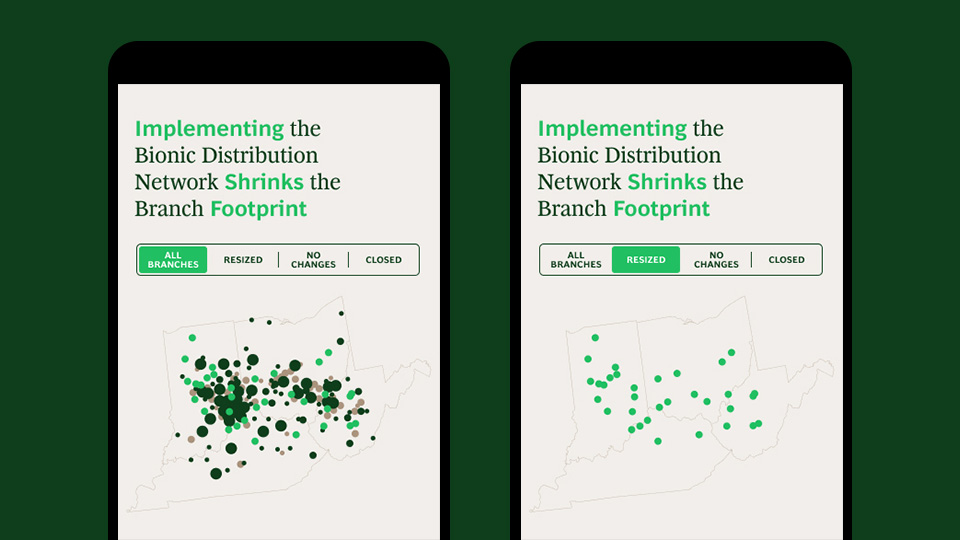
Interactive Subsets
Data subsets highlight change in data beyond the initial graphic.

Design
Strategy
Creative Direction
Art Direction
Visual Design
Motion Design
User Experience